Popover

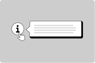
A small overlay that opens on demand, used in other components.

Props

maxWidth
string
Sets the maximum width of the popover container.
Defaults to 320px.
minWidth
string
Sets the minimum width of the popover container.
padded
boolean
Sets if the popover has padding. Use false when content needs to be flush with boundaries.
Defaults to true.
position
GoabPopoverPosition above | below | auto
Provides control to where the popover content is positioned.
Defaults to auto.
testId
string
Sets a data-testid attribute for automated testing.
mt, mr, mb, ml
Spacing
Apply margin to the top, right, bottom, and/or left of the component.
maxWidth
string
Sets the maximum width of the popover container.
Defaults to 320px.
minWidth
string
Sets the minimum width of the popover container.
padded
boolean
Sets if the popover has padding. Use false when content needs to be flush with boundaries.
Defaults to true.
position
GoabPopoverPosition above | below | auto
Provides control to where the popover content is positioned.
testId
string
Sets the data-testid attribute for automated testing.
mt, mr, mb, ml
Spacing
Apply margin to the top, right, bottom, and/or left of the component.
height
"full" | "wrap-content"
Controls the height behavior. 'full' stretches to parent height, 'wrap-content' fits content.
Defaults to wrap-content.
maxwidth
string | "none"
Sets the maximum width of the popover container.
Defaults to 320px.
minwidth
string
Sets the minimum width of the popover container.
padded
boolean true | false
Sets if the popover has padding. Use false when content needs to be flush with boundaries.
Defaults to true.
position
"above" | "below" | "right" | "auto"
Provides control to where the popover content is positioned.
Defaults to auto.
tabindex
number
Sets the tabindex. Use -1 to skip tabbing when a parent handles keyboard events.
Defaults to 0.
testid
string
Sets a data-testid attribute for automated testing.
Defaults to popover.
width
string
Sets a fixed width for the popover container.
mt, mr, mb, ml
Spacing
Apply margin to the top, right, bottom, and/or left of the component.

Events

_close
CustomEvent<void>
Emits when the popover closes.
_open
CustomEvent<void>
Emits when the popover opens.

ReactNode

target
ReactNode
Sets the element used as the popover trigger.
target
TemplateRef
Sets the element used as the popover trigger.
target
slot
Sets the element used as the popover trigger.
All GoA Design System components are built to meet WCAG 2.2 AA standards. The following guidelines provide additional context for accessible implementation.

No accessibility-specific guidelines have been documented for this component yet.

View old component docs