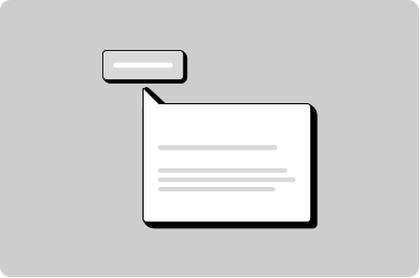
Menu button

A button with more than one action.

Props

ariaLabel
string
Sets the aria-label for the icon button in icon-only mode.
Defaults to Open menu.
leadingIcon
GoabIconType
Icon displayed before the button text. When no text is provided, displays as an icon button.
maxWidth
string
Maximum width of the dropdown menu.
size
GoabButtonSize compact | normal
Sets the size of the button.
Defaults to normal.
testId
string
Sets a data-testid attribute for automated testing.
text
string
The button label text. When provided, displays as a text button with a dropdown icon.
type
GoabButtonType primary | secondary | tertiary | start | text
The button style variant.
Defaults to primary.
variant
GoabButtonVariant normal | destructive | inverse | dark
Sets the color variant for semantic meaning.
Defaults to normal.
ariaLabel
string
Sets the aria-label for the icon button in icon-only mode.
Defaults to Open menu.
leadingIcon
GoabIconType
Icon displayed before the button text. When no text is provided, displays as an icon button.
maxWidth
string
Maximum width of the dropdown menu.
size
GoabButtonSize compact | normal
Sets the size of the button.
testId
string
Sets a data-testid attribute for automated testing.
text
string
The button label text. When provided, displays as a text button with a dropdown icon.
type
GoabButtonType primary | secondary | tertiary | start | text
The button style variant.
variant
GoabButtonVariant normal | destructive | inverse | dark
Sets the color variant for semantic meaning.
aria-label
string
Sets the aria-label for the icon button in icon-only mode.
Defaults to Open menu.
leading-icon
GoabIconType
Icon displayed before the button text. When no text is provided, displays as an icon button.
max-width
string
Maximum width of the dropdown menu.
size
"normal" | "compact"
Sets the size of the button.
Defaults to normal.
testid
string
Sets a data-testid attribute for automated testing.
text
string
The button label text. When provided, displays as a text button with a dropdown icon.
type
"primary" | "secondary" | "tertiary"
The button style variant.
Defaults to primary.
variant
"normal" | "destructive"
Sets the color variant for semantic meaning.
Defaults to normal.

Events

onAction
(detail: GoabMenuButtonOnActionDetail) => void
Callback fired when a menu action is selected.
onAction
(event: GoabMenuButtonOnActionDetail) => void
Emits when a menu action is clicked. Emits the action detail.
_action
CustomEvent<{ action?: string; size?: "normal" | "compact" }>
Emits when a menu action is clicked.
action
string
Action identifier included in the click event.
text
string
Display text for the menu action.
icon
GoabIconType
Icon displayed before the text.
testId
string
Sets a data-testid attribute for automated testing.
action
string
Action identifier included in the click event.
text
string
Display text for the menu action.
icon
GoabIconType
Icon displayed before the text.
testId
string
Sets a data-testid attribute for automated testing.
action
string
Action identifier included in the click event.
text
string
Display text for the menu action.
icon
GoabIconType
Icon displayed before the text.
testid
string
Sets a data-testid attribute for automated testing.
Examples

Header with navigation

Other

Don't use MenuButton for navigation menus. Use AppHeaderMenu or SideMenu for navigation. MenuButton is for action lists.
All GoA Design System components are built to meet WCAG 2.2 AA standards. The following guidelines provide additional context for accessible implementation.

No accessibility-specific guidelines have been documented for this component yet.

View old component docs