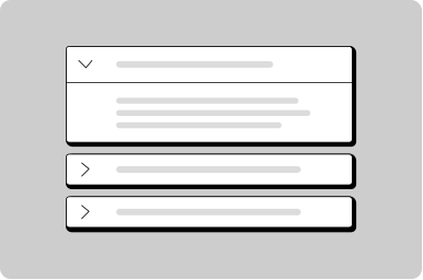
Details
Let users reveal more detailed information when they need it.
Props
heading
string
The title heading.
maxWidth
string
Sets the maximum width of the details.
Defaults to
75ch.
open
boolean
Controls if details is expanded or not.
testId
string
Sets a data-testid attribute for automated testing.
mt, mr, mb, ml
Spacing
Apply margin to the top, right, bottom, and/or left of the component.
Other
Don't
Don't stack multiple details together. Use an accordion instead for sets of information.
Do
Use details inline within a form to disclose more information as needed.
Content
Acceptable documents include utility bills dated within 3 months, bank statements, or government correspondence.
Do
Use details to show more information or to help the user make a decision.
Lorem ipsum dolor sit amet, consectetur adipiscing elit. Dui integer sagittis, quis felis eu viverra libero.
Do
Keep content within 50-75 characters for optimal line length.
Feedback
Don't
Don't add more than 140 characters to a tooltip; for lengthy information use the details component.